
Writers write, painters paint, genomics researchers… wait patiently for bioinformatics pipelines to finish processing NGS data, only to spend as much time visualizing results?
As long-time researchers and bioinformaticians, we’re well aware that in NGS data analysis, every bottleneck hampers innovation. For every hour spent feeding genomics data into algorithms, converting file formats, waiting for everything to finish processing to move onto the next step, you’re taking away valuable time that could be used to delve into downstream analysis and derive crucial insights.
We created Basepair to automate and exponentially speed up the time-consuming multistep process researchers have been undertaking to analyze NGS data. Today, Basepair’s web platform is a hit with everyone from university students and staff, to large enterprise teams who use our platform to analyze up to thousands of samples in parallel, with only a few minutes for setup, and less than an hour of processing time even for the most computationally expensive tasks.
Our goal was to give back individuals and teams the thousands of hours lost to manual NGS data analysis. But we didn’t see it fit to simply output resulting files and call it a day. We understand how crucial reporting and visuals are to downstream analysis – and what a pain it can be to set up. That’s why we include a host of rich visual and interactive components as part of our NGS data analysis report.
In addition to output files, Basepair includes three main reporting components that speed up downstream NGS data analysis: QC and alignment metrics, the Genome Browser, and interactive figures specific to certain workflows, such as an adjustable volcano plot for differential expression analysis and the Variant Browser for variant calling analysis.
What you see in your Basepair report
Depending on the workflow you choose for your RNA-Seq, ChIP-Seq, CUT&RUN, CUT&TAG, DNA-Seq, or ATAC-Seq data, your report will feature unique visuals and interactive elements. For example, let’s take a look at the overall report for an RNA-seq dataset from the Expression count workflow:
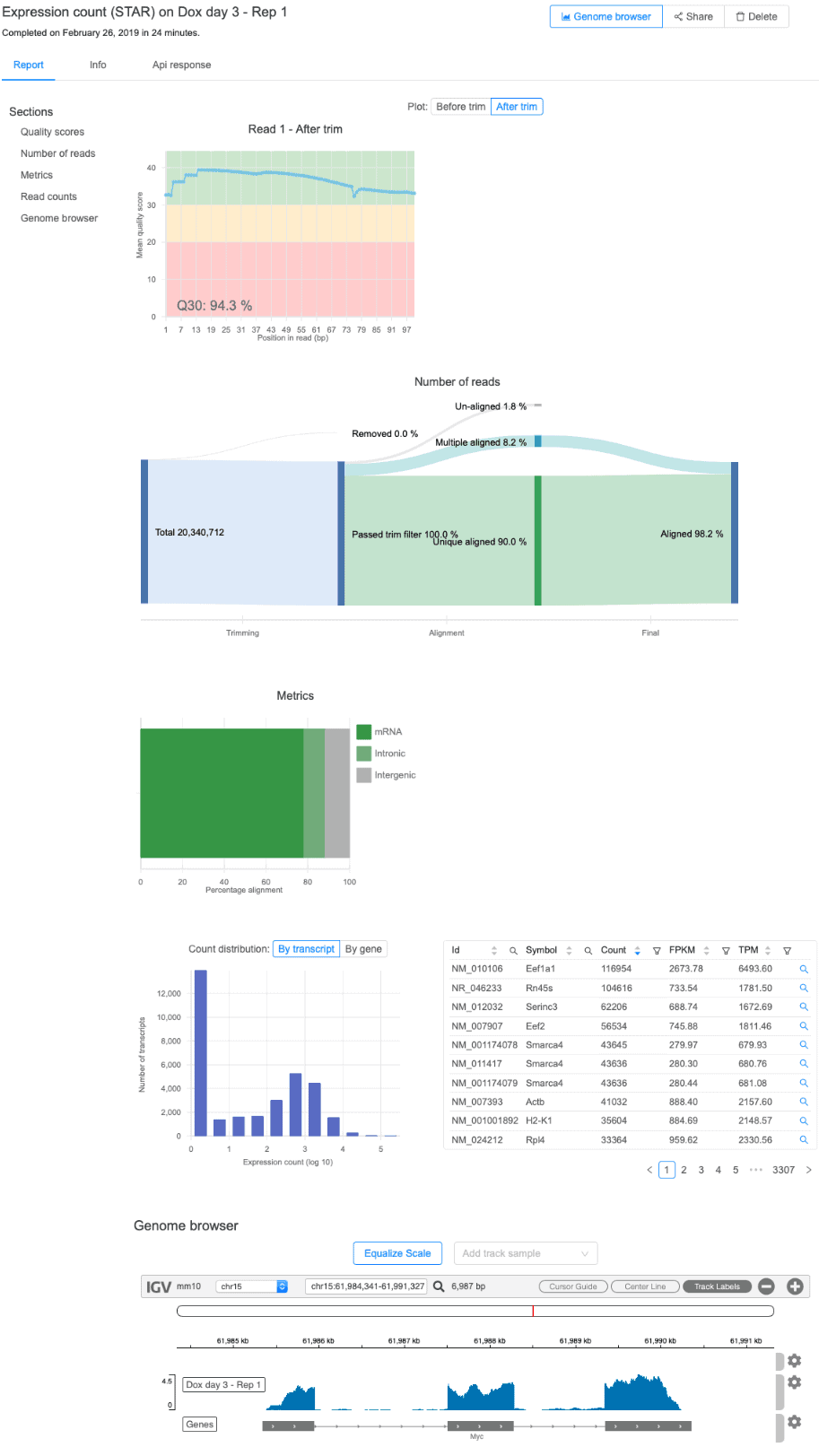
For this workflow, your report will include a summary of quality scores from raw and filtered reads, alignment statistics, as well as raw and normalized expression values at both the gene- and transcript-level. The distribution of gene expression levels is also shown along with a built-in genome browser displaying the data (more on this feature below).
Now let’s take a peek at a DESeq2 report:
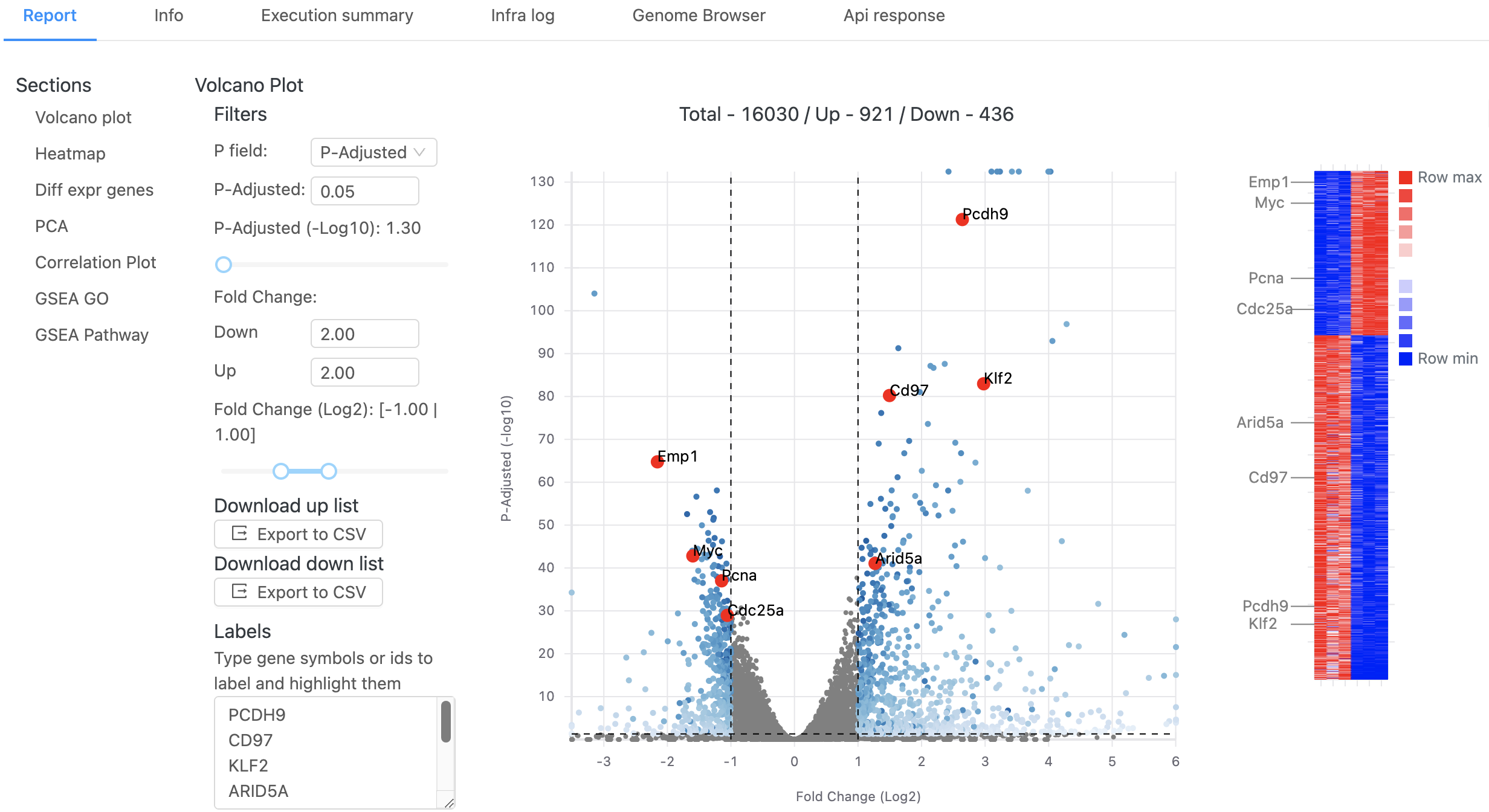
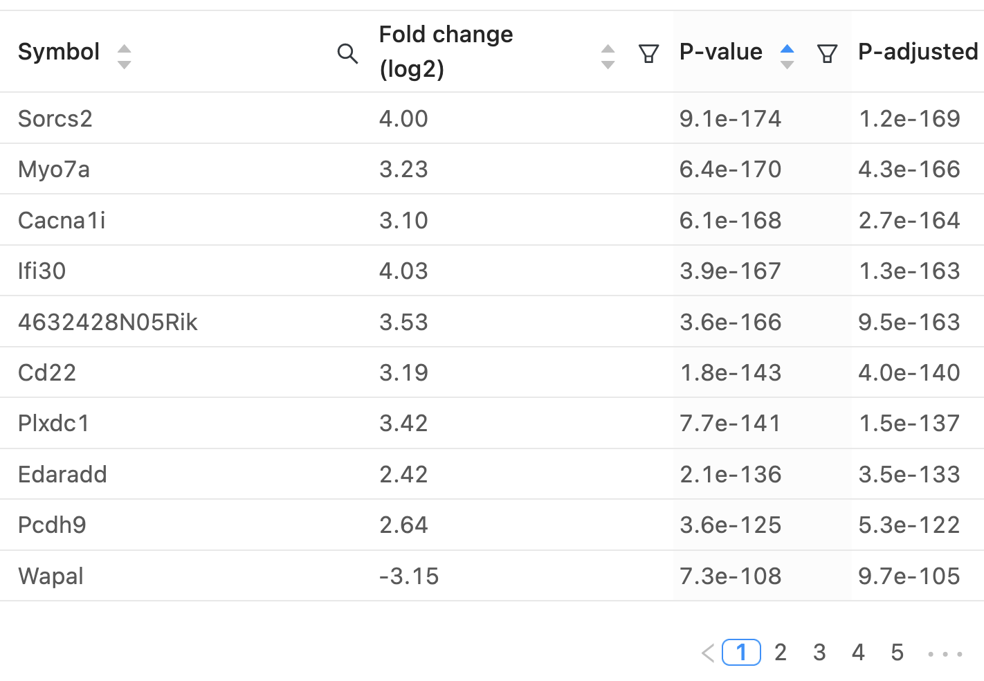
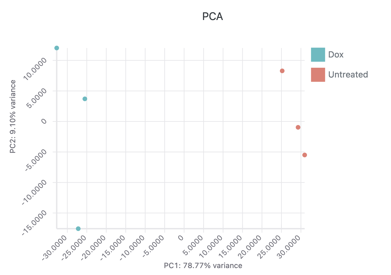
The interactive report page can be adjusted to use different p-value or fold-change thresholds and specific genes of interest can be labeled on both the volcano plot and heatmap. A table containing the differential expression results for all genes is available and a PCA plot of all samples is also displayed. Here’s a video of these interactive elements:
One size definitely doesn’t fit all in the NGS data analysis world, which is why we made sure each of our 30 workflows has a tailored set of graphs and tables to best represent your genomics data. Let’s further explore the types of plots you will see in Basepair’s reports.
For DNA-seq data, the Alignment (BWA) workflow provides a report containing QC and alignment statistics along with a coverage plot that summarizes sequencing depth along the genome.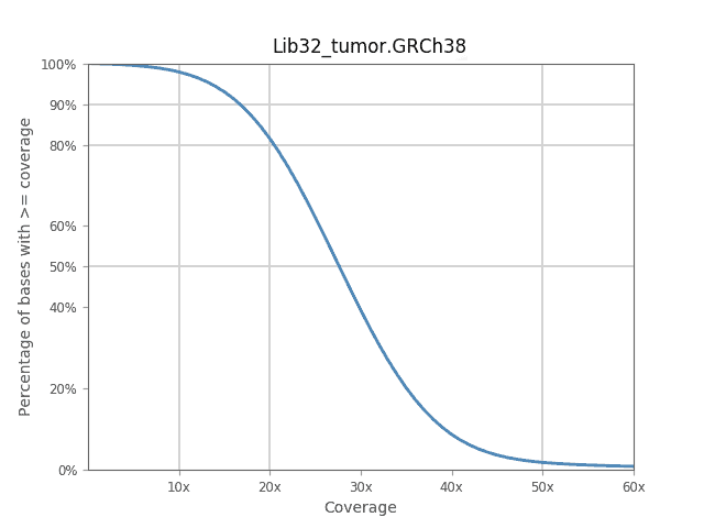
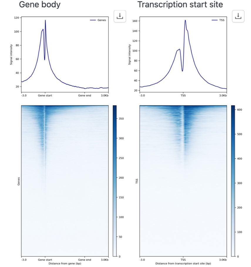
For locating peaks and motifs in ChIP-Seq, CUT&RUN, CUT&TAG data, we use MACS2 or SEACR for peak-calling and Homer for motif identification. The report also automatically generates heatmaps and average profile plots at gene annotations.
Feel free to explore these plots and many others with your own data by signing up for a free 14-day Basepair demo.
Exploring raw data in Basepair’s Genome Browser
Each report includes an integrated genome browser, providing an interactive visualization of your raw data.
Each of the tracks above is customizable – you are able to set name, height, color, and data range to your preferences, as well as add or remove tracks. The Genome Browser is a quick method of assessing data quality, honing in on specific genes, and generally observing your dataset.
Exploring variant data in the Variant Browser
Downstream analysis of DNA-Seq data can often begin with thousands or even millions of raw variant calls. What can you do with this data? Which of these variants are of interest? We received many inquiries for suggestions around this topic. In response we developed the Variant Browser.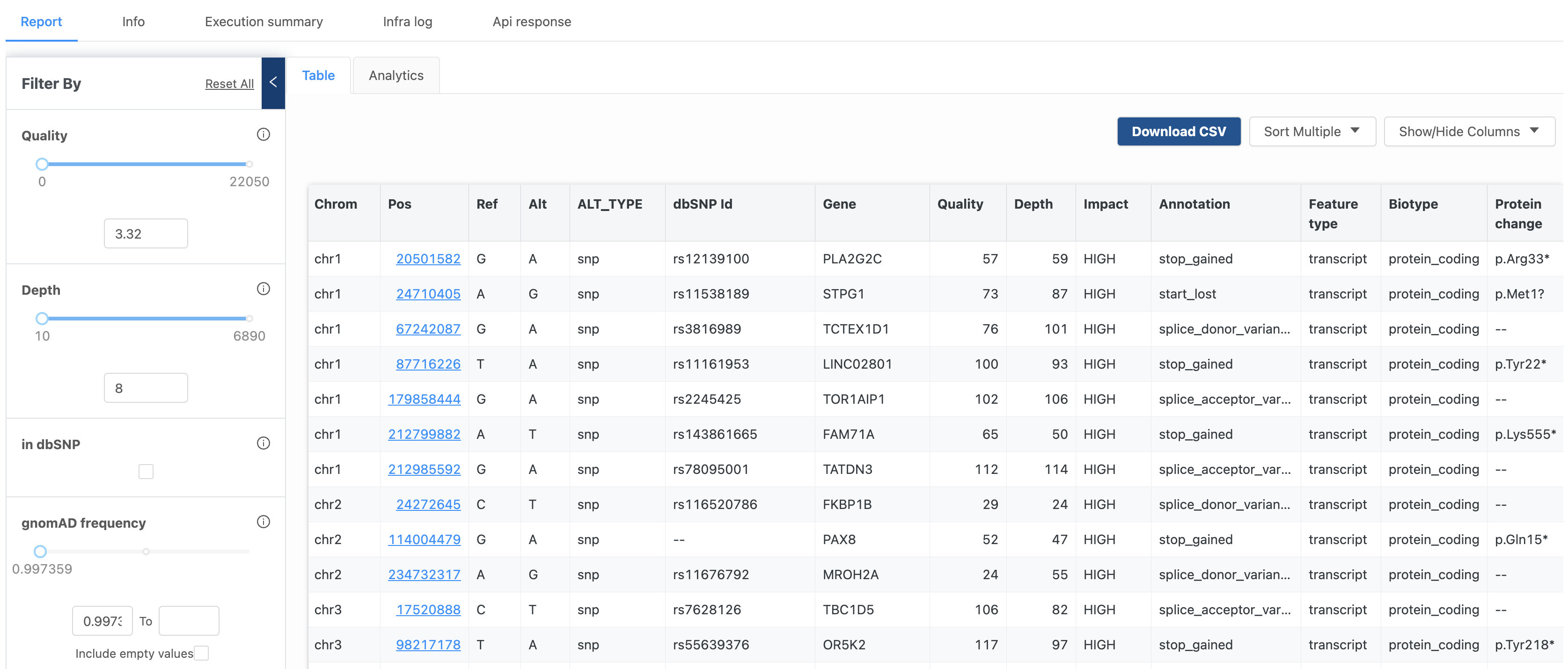
Now, DNA-Seq data analyzed via the Variant Annotation or Variant Calling workflows includes an interactive variant browser that allows Basepair users to experiment with various parameters and filters, making the discovery of useful data more intuitive, and much faster.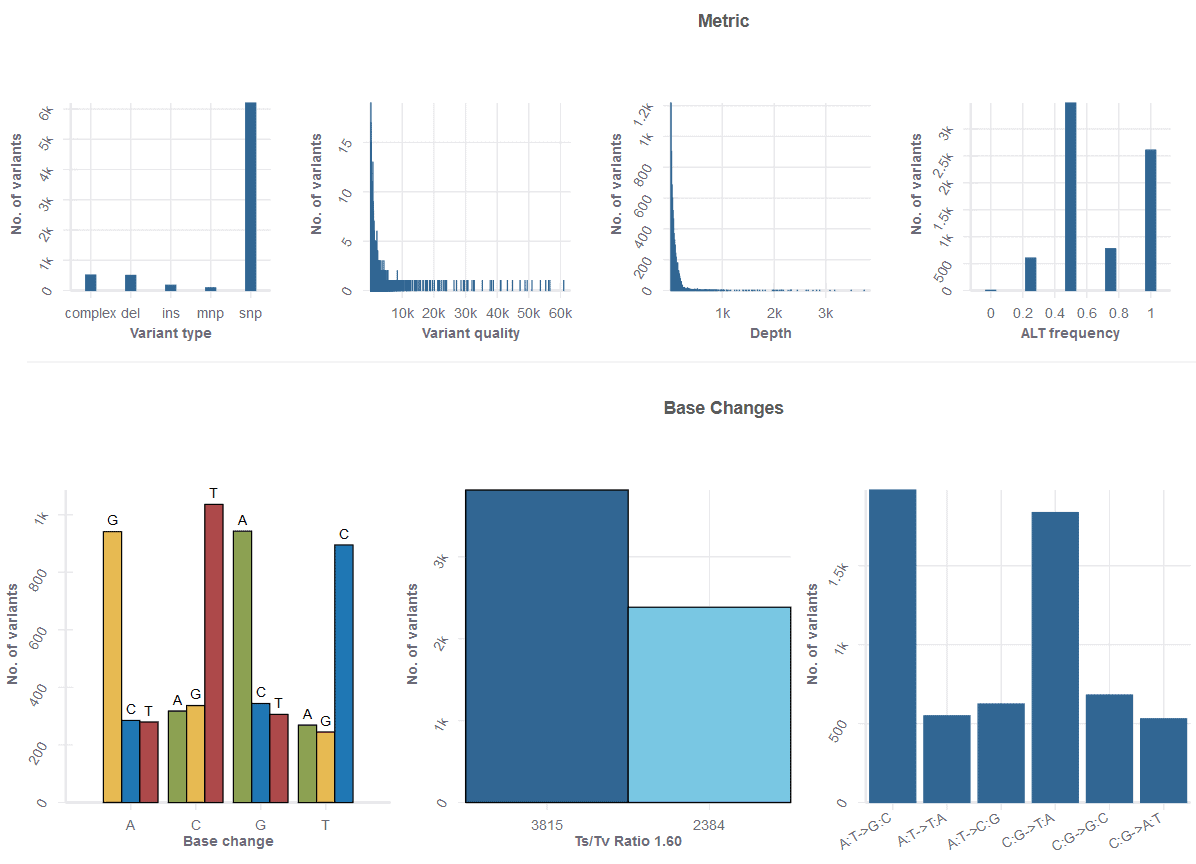
Parameters include quality, depth, gnomAD frequency, and alternate reads frequency sliders, among many more. You can also filter by specific gene, annotation, feature type, or chromosome. In addition to the powerful flexibility of the table, an Analytics tabs takes you to a set of useful metrics, from base change counts, to the number of variant types, to a host of other useful plots.
At Basepair, our mission is to make NGS data analysis as seamless, fast, and rewarding as possible, so you can focus on what you do best. Our interactive reports include a variety of workflow-specific graphs, tables, and interactive elements that streamline reporting and downstream analysis, no matter how large the number of samples is.
Explore our sample reports – and try analyzing your own data – free for 14 days (no card details necessary).